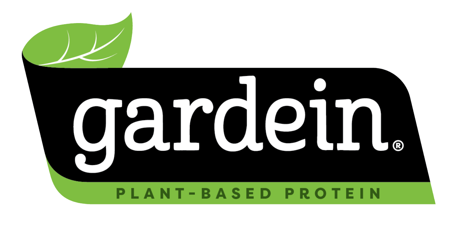
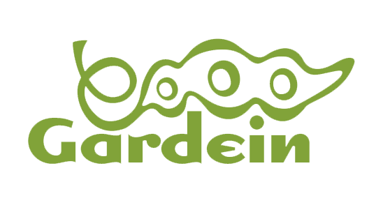
Old Logo New Logo
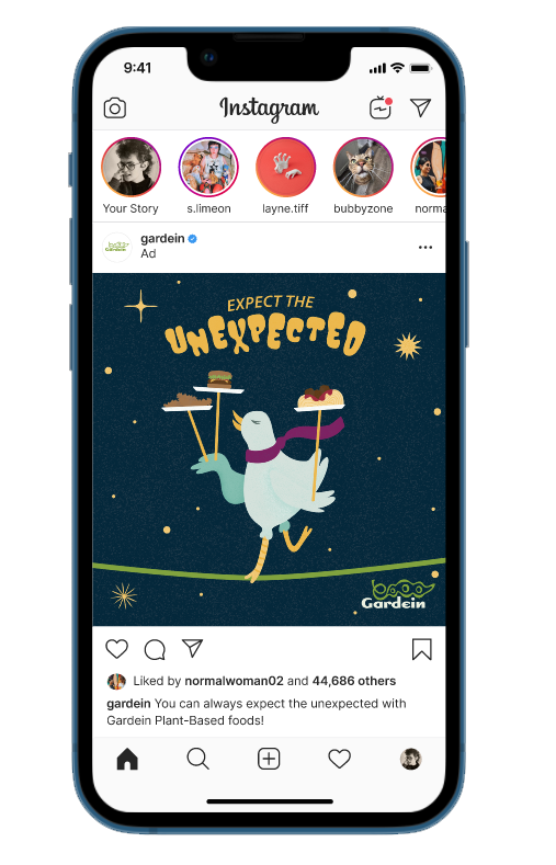
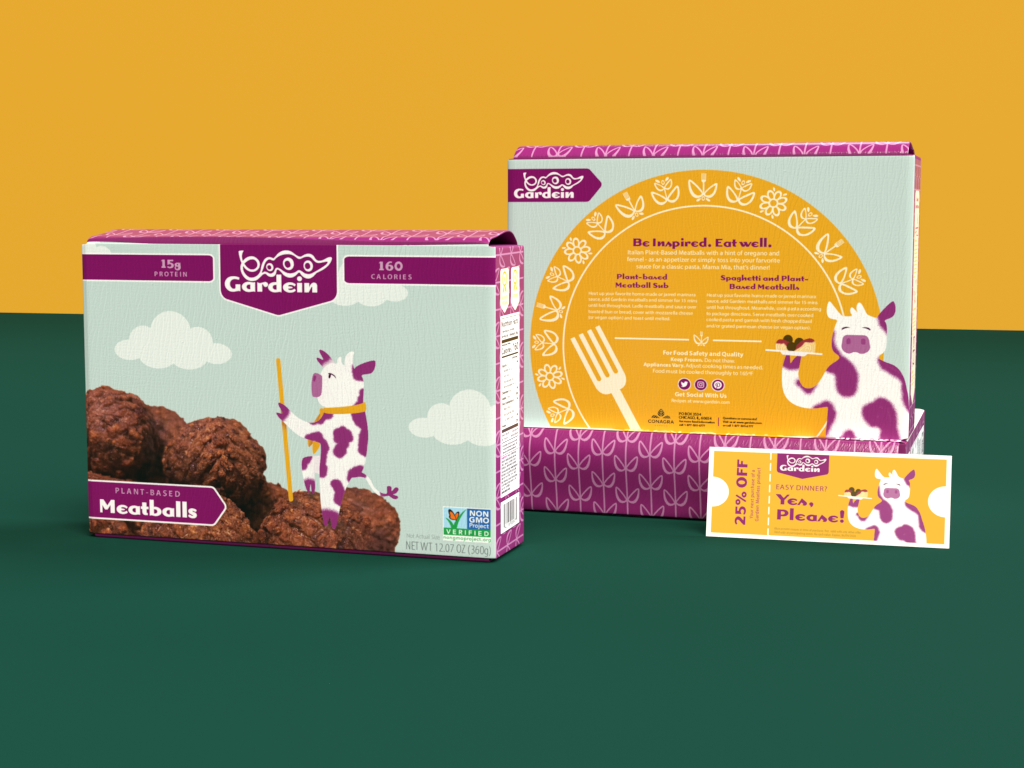
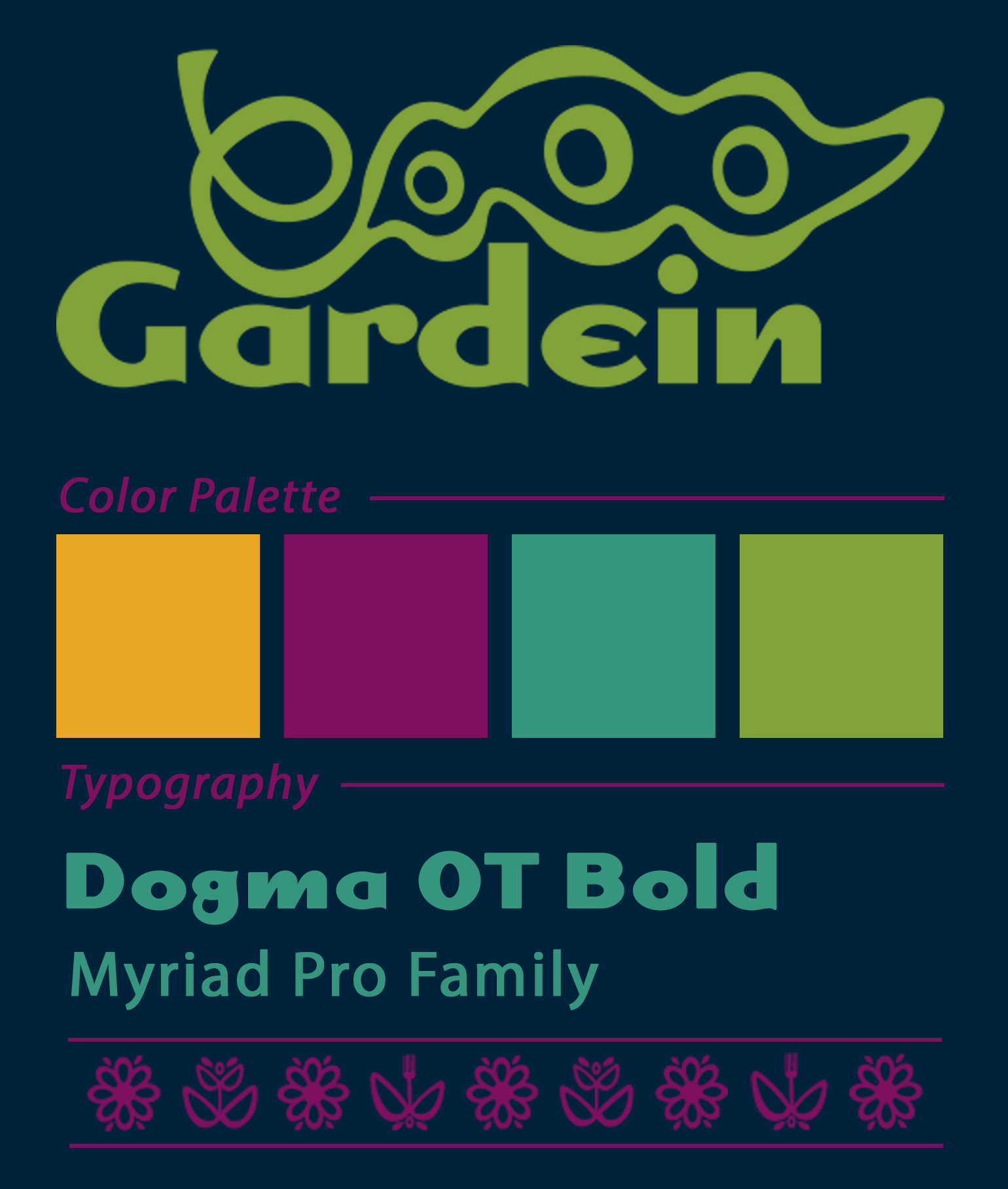
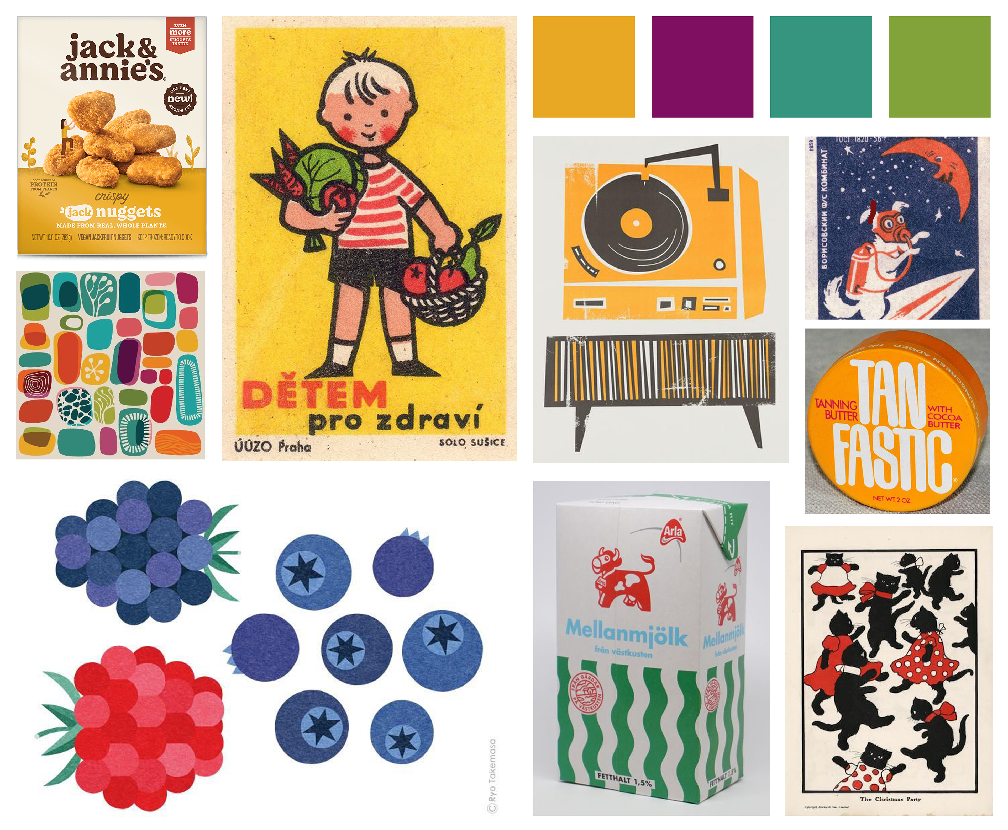
In recent years, the popularity of plant-based diets and trends such as Meatless Monday has led to an explosion in the number of meatless meat options. As more consumers switch to a plant-based lifestyle, the need for Gardein to stand out against the competition increases. The current branding melts into the store shelves with other established brands while newer brands shine with bold, unique branding. Gardein deserves to shine as well, so the brand needs a new bold, handmade feel to excite returning customers and introduce new people to the brand. As a chef-created brand, a handmade quality is important and can be portrayed through flat, cut-paper style illustrations in packaging and advertising. To make the branding more cohesive, a character and main color from the retro-inspired palette will be assigned to each type of meat substitute- for example, plant-based beef products will feature a maroon cow mascot and mostly maroon package. The introduction of characters creates a story that engages the customer and makes the new branding memorable. Gardein’s current logo is visually heavy and doesn't visually fit with the new proposed aesthetic. The new logo will focus on the ‘garden’ and ‘homegrown’ aspects of the products, featuring a stylized pea and organic-feeling typeface. All of these elements will come together to create a fresh and exciting new identity for Gardein that will be able to carry the brand into the future of plant-based foods.
Gardein Rebrand- Logo, Print and Social Media Ads, Packaging, Takeaway, Branding Guide, Moodboard * Adobe Photoshop, Adobe Illustrator, Adobe Dimension, 2024